Optic /
A Body Worn Camera Companion App
overview
Optic is a mobile companion app built for first responders who rely on Body Worn Cameras (BWCs) in their daily work. It pairs directly with the user’s camera to create a seamless bridge between the physical device and a clean, intuitive mobile interface. The goal was simple: empower users with an easy, low-friction way to store, organize, and quickly retrieve essential media, all while they focus on capturing real-time data on the job.

This project pushed me to design with clarity, purpose, and empathy. Optic is my take on meaningful design: purposeful, clear, and built to make someone’s workday just a little smoother.
role
UX Designer
(3 person team)
February 2024
(6 weeks)
skills & tools
ideation / prototyping / user testing / collaborating / figma
the process /
the research
interview
To ground the project in real experience, we interviewed a police officer who uses a BWC on a regular basis. We wanted to understand what actually matters in the field.
sample questions
- "Describe your experience using a BWC."
- "How do you access footage captured by a BWC?"
- "What features do you find most useful in a BWC?"
insights
- Marking important moments during a recording is essential.
- Labeling/categorizing media is just as crucial.
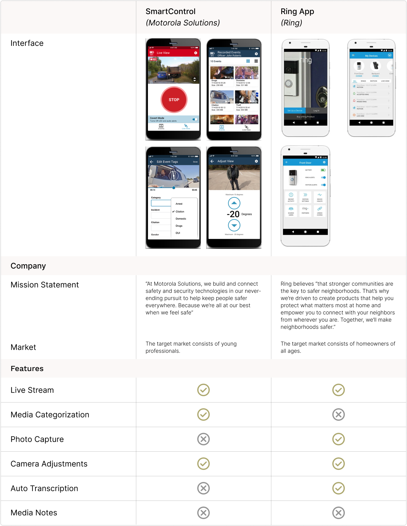
competitive research
the ideation
concept mapping
I kicked off with a concept map because I love turning scattered ideas into something simple and structured. Three core components became clear: media access/management, data capture, and system settings. From there, the key user tasks took shape.
identifying user tasks
Together, the team outlined the essential user tasks. These tasks became the backbone of the app’s flow.
primary tasks
- Sync Mobile Device with Hardware
- Login (Face ID/Pin)
- Organize Media
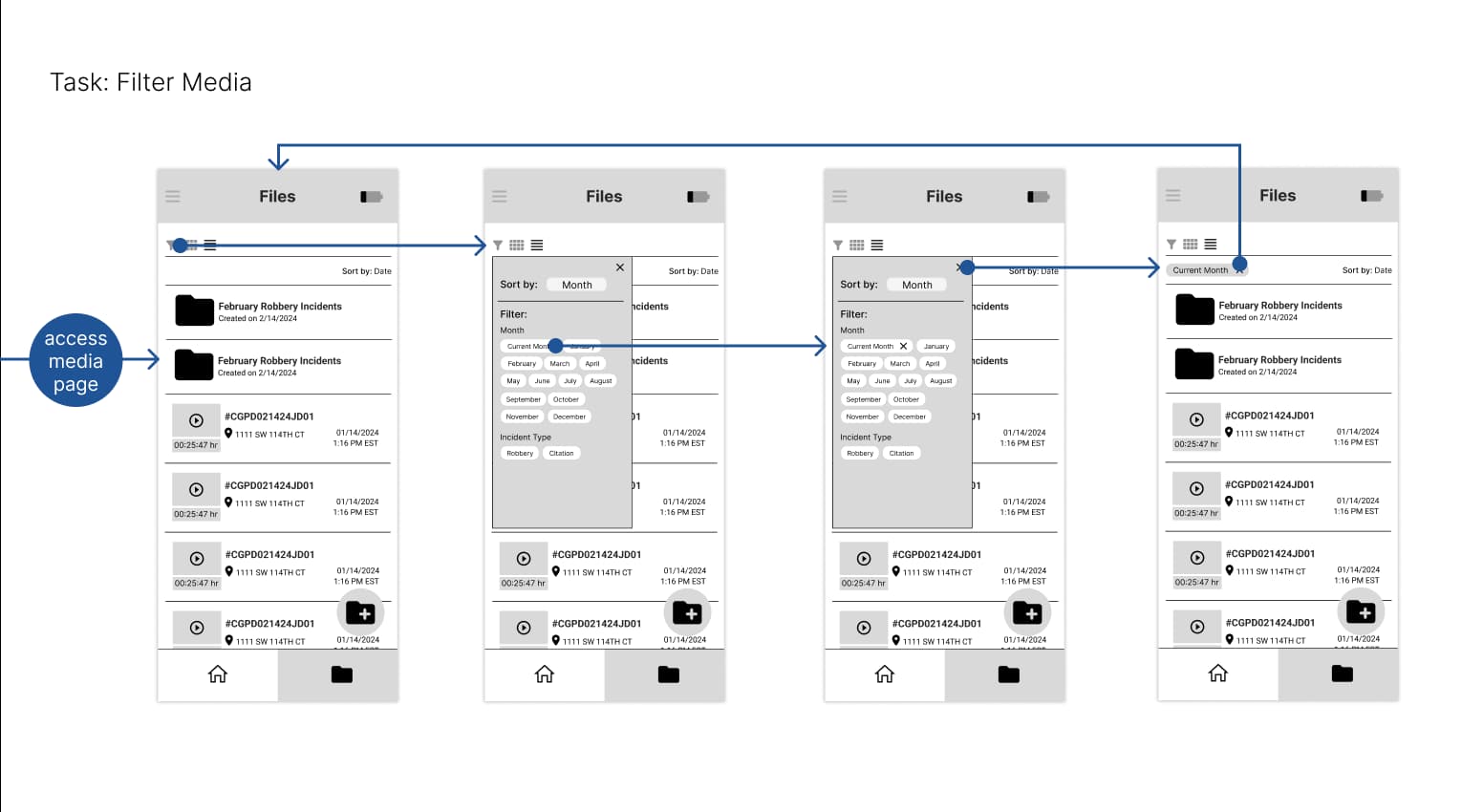
- Filter Media
- Record Videos
- Capture Photos
secondary tasks
- View Videos (with or without audio)
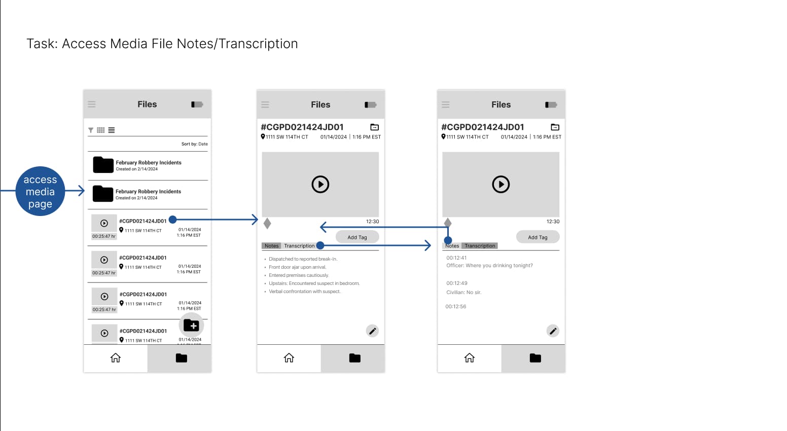
- View Transcription
- View/Add Tag
- Enter Notes
- View Live Feed
- Mark Moments (while recording)
- Mark Moments (while viewing)
- Access Settings
the designs
low fidelity wireframes
I designed the following wireframes based on user task flows:  
styles
Collectively, the team finalized styles. Click here for the full style guide.
prototype
After applying styles to finalized wireframes, I created early prototypes which were tested by several users.
the testing
Participants were encouraged to think out loud as they used the application. Using a feedback capture grid, they offered their ideas, questions, likes and dislikes about the application.  
user insights
- Participants found it difficult to navigate the media function.
- Participants pointed out the lack of usability, the small iconography, and small filtering options.
the iterations
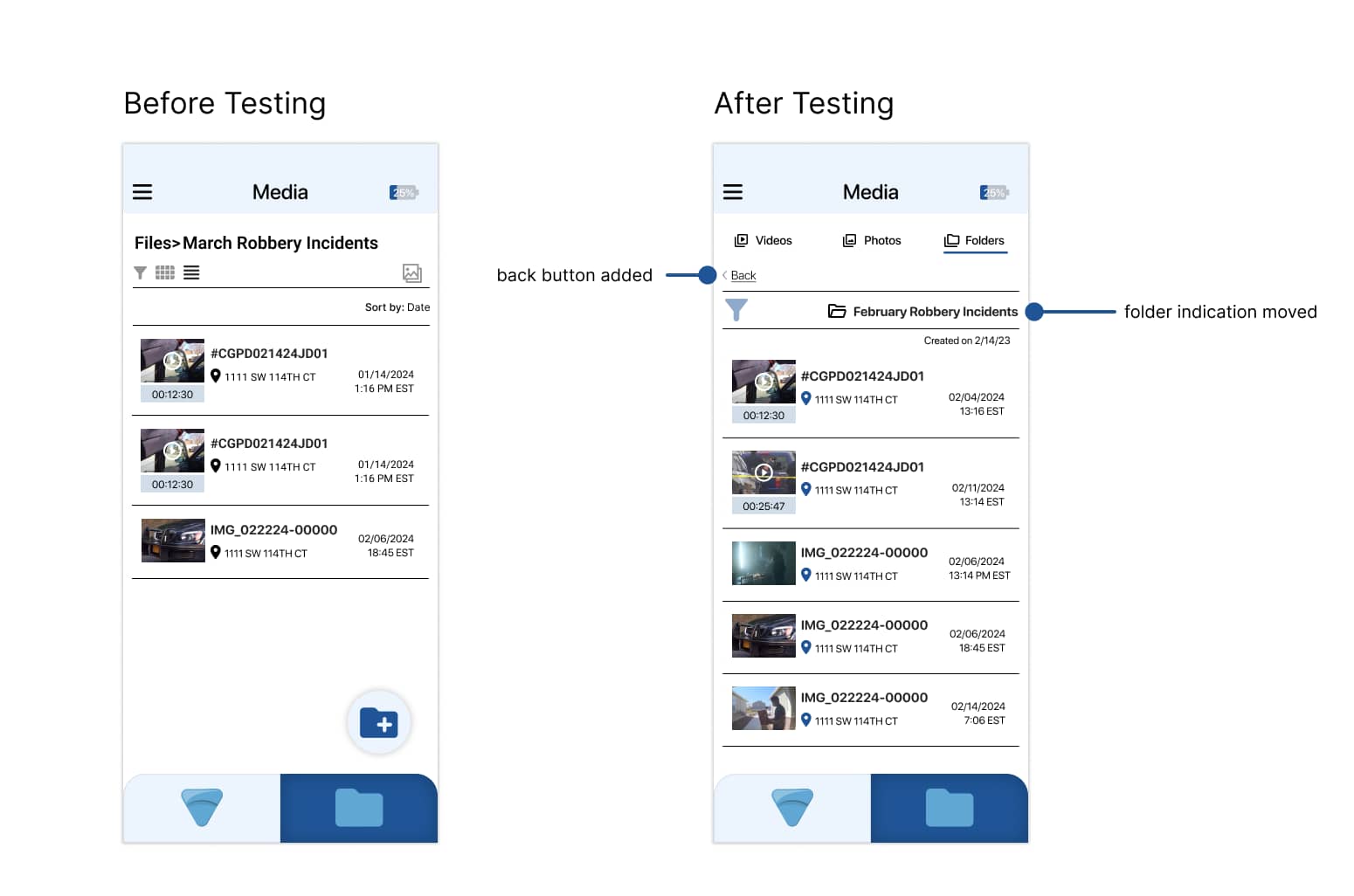
I made the following changes upon considering user insights:
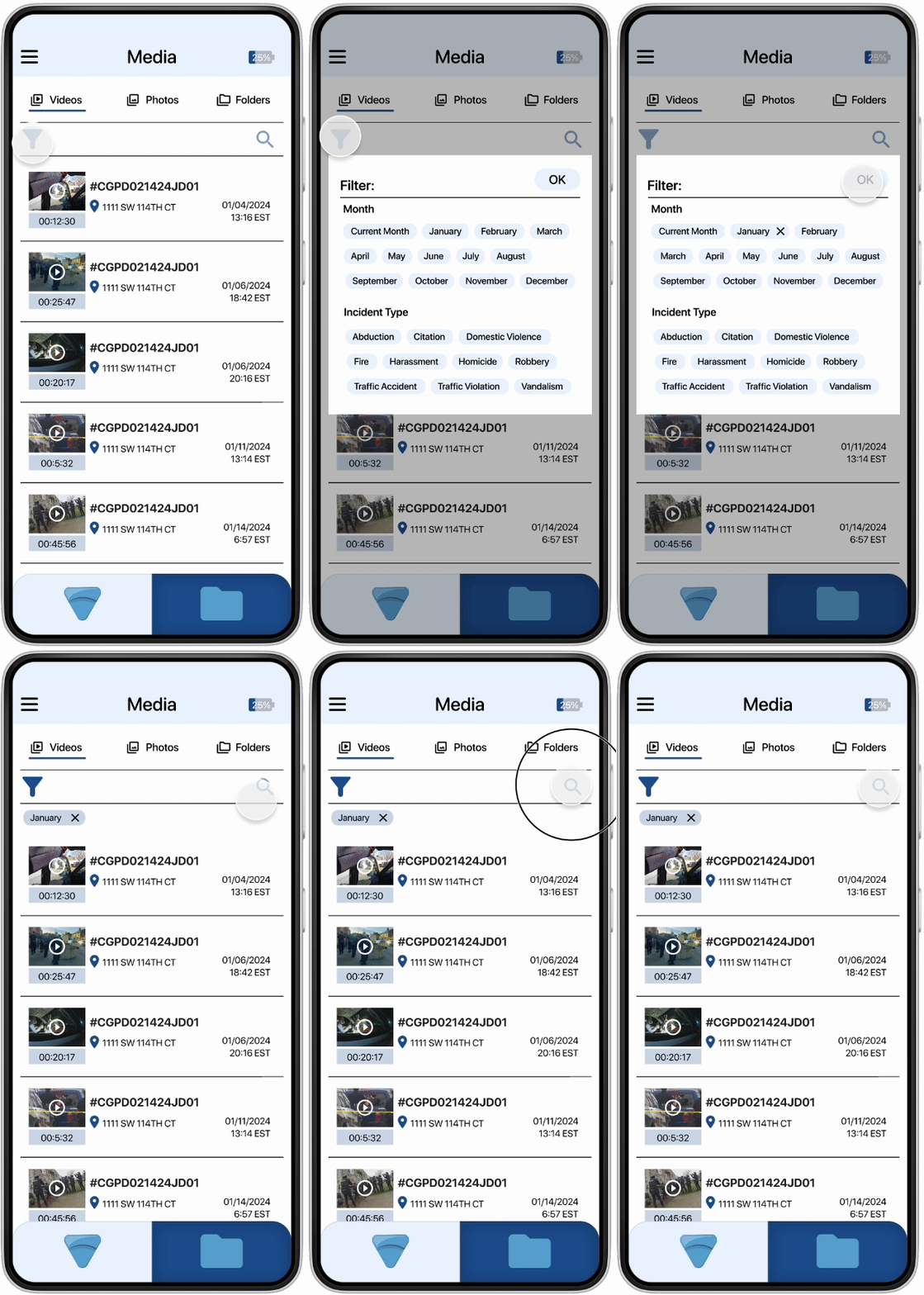
Participants found the media page overwhelming and hard to navigate. I addressed this by adding a clear navigation bar (to allow users to switch between videos, photos and folders), enlarging the filter icon (to enhance visibility), removing view options (to reduce cognitive load), and incorporating a search bar (to facilitate quick and easy access to specific files.)
Participants struggled to navigate through individual folders. I addressed this by adding a back button (to give users a clear path out of the folder) and relocating the folder (to enhance visibility.)
the final designs
Navigate media by videos, photos and folders.
Filter and search media easily.  
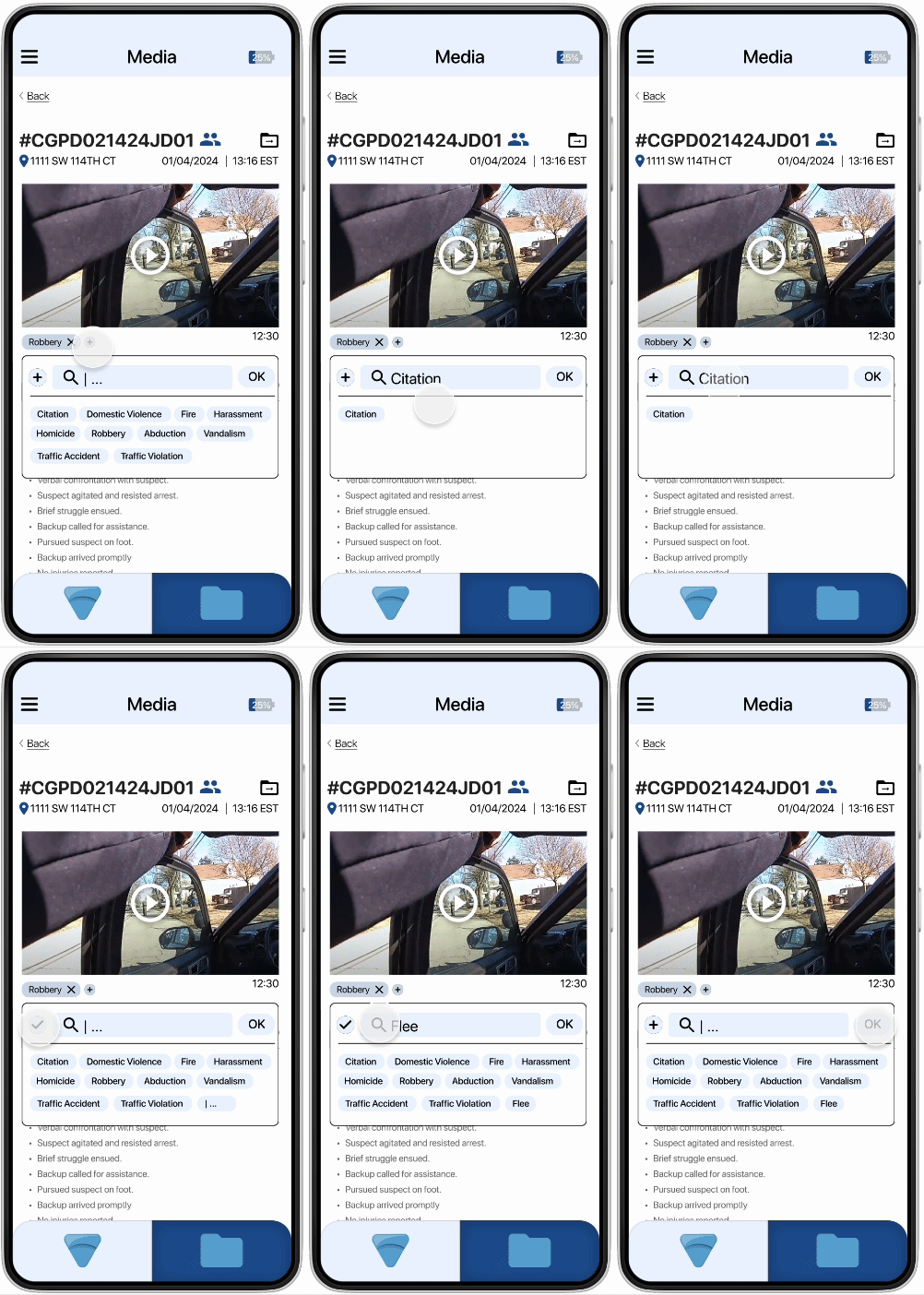
Categorize media by adding tags.
Categorize media by creating folders.
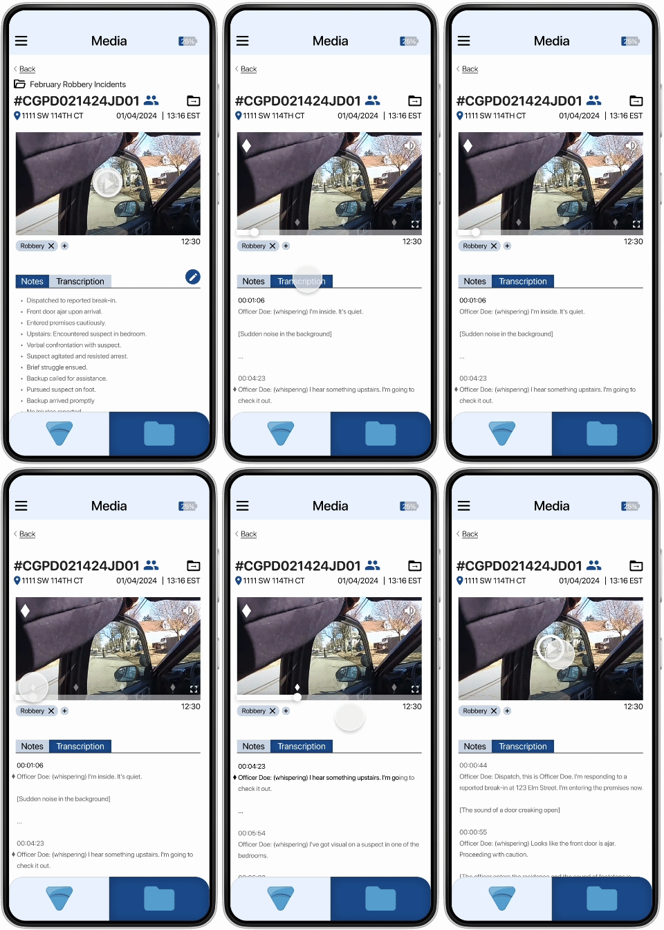
Mark important moments in videos and view marked moments.   
Navigate media by videos, photos and folders.
Filter and search media easily.  
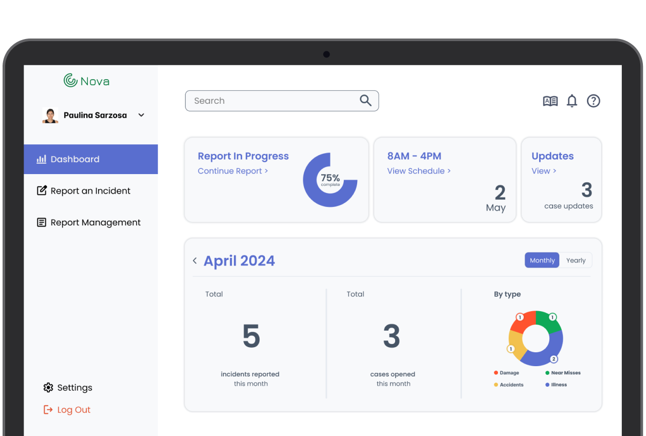
Interact with several data elements within the dashboard.
Categorize media by adding tags.
Interact with several data elements within the dashboard.
Categorize media by creating folders.
Mark important moments in videos and view marked moments.   
impact /
Optic was one of the first big projects I worked on, and I’ll be honest, I felt a little overwhelmed at first. I turned that into structure by defining my process early and jumping straight into user research. Those initial conversations with a real first responder were profoundly eye-opening and reminded me why connecting with people is the best way to start any project. It also helped me lock in a process I actually love: identifying user tasks first, then building everything else from there.

And yes… this project made me a Figma wizard. Components, auto-layout, reusable styles. From components to auto-layout to reusable styles, I learned to make use of every feature that magical software has to offer. Overall, Optic really reinforced why I love this work: because good design creates meaning and makes people's lives a little bit easier.
more case studies!